
Source Library uses a facing-page reader: the original manuscript scan on the left, AI translation on the right. This mirrors how scholars have read texts for centuries: the Loeb Classical Library, Budé editions, and every bilingual critical edition since Erasmus.
But for ancient Near Eastern texts (Sumerian, Akkadian, Egyptian), there's a problem. These languages are written in scripts most readers can't parse visually. The scan of a cuneiform tablet or hieratic papyrus doesn't help you follow along the way a Latin or German page does. The visual parallel breaks down.
Interlinear display solves this differently: instead of image vs text side by side, it weaves the original and translation together line by line. You see the transliteration (the scholarly romanization) directly above or below the English, aligned to the same poetic structure.
The question: which is better for these texts?
The Facing-Page Approach (current)
How our reader currently displays an ETCSL text. Left panel: scan or placeholder. Right panel: continuous translation.

K.3514, Tablet IX
Gilgamesh spoke to him, to Utnapishtim the Faraway:
"I look at you, Utnapishtim,
your form is no different — you are just like me!
You are not different at all — you are just like me!
My heart had imagined you doing battle,
but you lie here idle on your back!
Tell me, how did you join the Assembly of the Gods
and find eternal life?"
Strengths: You see the actual artifact. The translation reads as continuous prose. Works for any text with scans. Universal layout.
Weakness: For cuneiform/hieratic, most readers can't follow along in the scan. The poetic structure (parallelism, repetition) is invisible in paragraph form.
The Interlinear Approach
Same text, displayed with transliteration and translation aligned line by line. No scan image: the structure itself becomes the artifact.
Epic of Gilgamesh, Tablet XI (Akkadian)
Instructions of Shuruppag (Sumerian, c. 2600 BCE)
Tale of Sinuhe (Egyptian, c. 1875 BCE)
Three tiers: transliteration, German (source translation from ORAEC), English.
Strengths: Poetic structure visible immediately (parallelism in Shuruppag, the anaphora in Gilgamesh). Readers can notice patterns in the original even without knowing the language. Takes less screen space than facing page. Better on mobile.
Weakness: No connection to the physical artifact. Loses the materiality of clay/papyrus. Transliteration may overwhelm casual readers who just want the story.
The Hybrid: Tablet + Interlinear
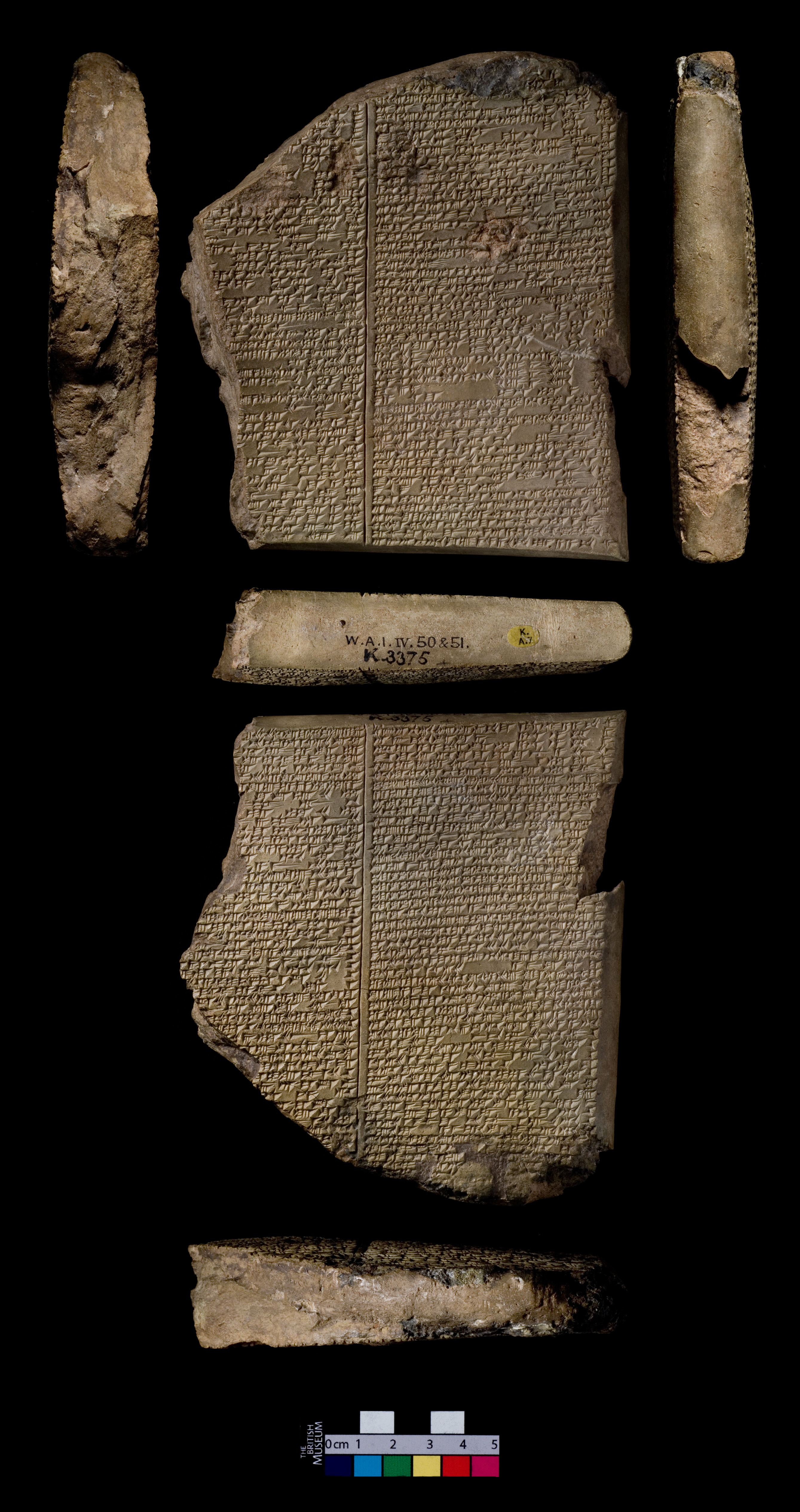
What if we combine both? Tablet photo on top (or left), interlinear below. This is roughly what /read/gilgamesh does.
Observations
For poetry (most ancient Near Eastern lit), interlinear wins. The parallelism in Shuruppag, the repetition in Gilgamesh: these are structural features that facing-page prose translation erases. Interlinear preserves them naturally.
Facing page still wins for scanned books. For our 15,000+ books with actual manuscript scans (Latin, German, Greek, Arabic), the facing-page layout is ideal. The reader CAN follow along in the original. The image carries real information.
The hybrid is best for tablet literature. Show the artifact (it's beautiful, it's material, it grounds the text in physical reality), but don't ask the reader to “read along” in cuneiform. Give them the interlinear below or beside it.
This suggests a rule: If the original script is readable by the likely audience (Latin, Greek, German, Arabic, Hebrew), use facing page. If it's not (cuneiform, hieratic, demotic), use interlinear + artifact photo.
Next steps
- Add an interlinear toggle to the reader for ETCSL and ORAEC texts
- Build the tablet reader as the hybrid model for Gilgamesh, Enuma Elish, etc.
- Explore word-level alignment: hover a Sumerian word to highlight its English gloss
- Test: does the three-tier (original + German + English) add value, or should we collapse to two?
Source texts: Instructions of Shuruppag (ETCSL 5.6.1), Epic of Gilgamesh (Thompson 1930), Tale of Sinuhe (ORAEC). Tablet photo: CDLI P273210 (K.3375, British Museum).


